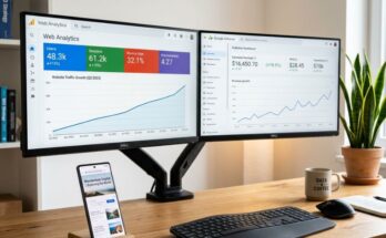
You have optimized your content, mastered keyword research, and traffic is finally flowing to your website. Yet, looking at your Google AdSense dashboard feels like a punch in the gut. Your earnings are stagnant, and your Click-Through Rate (CTR) is hovering somewhere near rock bottom.
It is a frustrating reality for many publishers. High traffic does not automatically equal high revenue if your ad architecture is flawed. Monetization is a delicate balance of user psychology, spatial awareness, and layout design.
To fix this, we need to move past standard advice and analyze how users actually interact with screens. Let us dismantle your current layout and rebuild it into a high-performance, high-CTR engine tailored for premium US advertisers.
—
The Psychology of User Attention and CTR Dynamics
Before placing a single ad unit, you must understand how human eyes scan a webpage. Users do not read digital content the way they read a physical book. They skim, jump, and look for immediate visual anchors.
The F-Shaped Scanning Pattern on Desktop
On desktop screens, western users overwhelmingly scan content in an F-shaped pattern. They read the top horizontal bar, move down the page slightly, read a shorter horizontal path, and finally track down the left side of the screen.
If your high-paying ads are buried in the right-hand sidebar or shoved below the footer, you are practically giving money away. To capture maximum user attention, your ad units must intercept these natural visual pathways without breaking the reader’s flow.
The Vertical Scroll Reality on Mobile Devices
Mobile completely flips the script on user psychology. There is no sidebar, no sprawling horizontal space, and user attention is locked into a tight, vertical corridor.
Mobile users scroll fast and possess incredibly short attention spans. On small screens, visibility is everything, which means your mobile strategy requires a completely different set of placements compared to desktop.
—
Desktop Ad Placements That Move the Revenue Needle
Desktop layouts give you more real estate to play with, but they also offer more opportunities to make critical layout mistakes. To command premium Cost Per Click (CPC) from US advertisers, you need to target the high-visibility zones.
1. The Leaderboard: Above the Fold vs. Below the Header
A classic 728×90 or 970×90 leaderboard placed at the absolute top of the page often suffers from banner blindness. Users have trained themselves to ignore the very top edge of websites.
Instead, try placing your leaderboard directly *below* your primary navigation bar or just above the main article title. This subtle shift keeps the ad within the user’s viewing field as the page loads, significantly boosting your viewability scores.
2. The In-Content Sweet Spot: After Paragraph 2 or 3
This is where the magic happens for desktop CTR. When a reader lands on your article, they are highly engaged during the first few paragraphs. Placing a 336×280 large rectangle or a native ad right after the second paragraph yields incredible results.
During my time optimizing an automotive niche site, shifting our in-content ad from paragraph six up to paragraph two resulted in an immediate 140% spike in CTR. It catches users right when their engagement is peaking.
3. The Sticky Sidebar: Leveraging Long-Form Scrolling
Standard sidebar ads die the moment a user scrolls down your page. A sticky or fixed sidebar ad solves this problem permanently.
Use a 300×600 half-page ad unit and configure it to lock into place as the user scrolls through your long-form content. Because it stays in view longer, advertisers bidding on viewable Cost Per Mille (eCPM) will compete aggressively for this slot.
| Desktop Ad Unit | Optimal Size | Expected CTR Impact | Best Practice Tip |
|---|---|---|---|
| In-Content Rectangle | 336×280 / 300×250 | High | Place after paragraph 2 or 3; wrap text naturally around it. |
| Sticky Sidebar | 300×600 | Medium-High | Ensure it stops before hitting the footer to avoid overlap issues. |
| Below-Header Leaderboard | 970×90 / 970×250 | Medium | Use responsive sizing so it scales down neatly on smaller monitors. |
—
Mobile Ad Placements for Maximum Thumb Engagement
Mobile traffic now accounts for the majority of web views, especially in competitive markets like the US. If your mobile CTR is lagging, your entire monetization strategy is bleeding cash.
1. The Power of Mobile Anchor (Sticky) Ads
Anchor ads attach themselves to the bottom of the smartphone screen and remain visible as the user scrolls. They are small, unobtrusive, and highly effective.
Because they maintain a near-100% viewability rate, Google AdSense heavily optimizes these units for high-paying advertisers. They consistently deliver some of the highest CTRs on mobile devices without ruining the user experience.
2. Mid-Content Interstitials and Responsive Blocks
On mobile, your text content forms a single column. Placing a responsive display ad every 400 to 500 words ensures that as the user scrolls, they encounter an ad unit at regular intervals.
Avoid stacking ads back-to-back, as this violates Google’s policies and alienates your readers. Space them out naturally, treating them like visual breathers between dense blocks of text.
3. The Danger Zones: Placements to Avoid on Mobile
Never place a large 300×250 ad unit at the absolute top of a mobile site if it pushes your main content completely off the screen. Google penalizes sites for this under their Page Layout Algorithm.
Additionally, avoid placing ads directly next to interactive buttons, drop-down menus, or pagination links. This causes accidental clicks, which leads to invalid traffic warnings and suppresses your smart-pricing CPC metrics over time.
—
Advanced Optimization Strategies for Premium US Traffic
Traffic originating from the United States commands some of the highest CPCs in the digital publishing space. Advertisers are willing to pay top dollar, but only if your layout delivers genuine engagement.
Expert Insight: High CPC is not just about where the ad sits, but how long it remains viewable. Google tracks “Active View” metrics. An ad that is visible for 30 seconds commands a significantly higher premium than one scrolled past in two seconds.
Harnessing Google Auto Ads with Manual Controls
Many publishers turn on Auto Ads and walk away, leaving their site looking like a chaotic classifieds page. The pro move is to use a hybrid approach.
Turn on Auto Ads but exclude specific areas—like your header or your primary landing pages. Let Auto Ads handle high-yield formats like Vignettes (full-page ads between page loads) while you manually place your in-content and sidebar units for surgical precision.
A/B Testing Your Ad Placements
Never rely on guesswork. Use the built-in experiments tool inside your Google AdSense dashboard to test different layout variations against one another.
Run a test comparing a 300×250 rectangle against a 336×280 rectangle in your first in-content slot. Let the experiment run for at least two weeks or until it reaches statistical significance before declaring a winner.
—
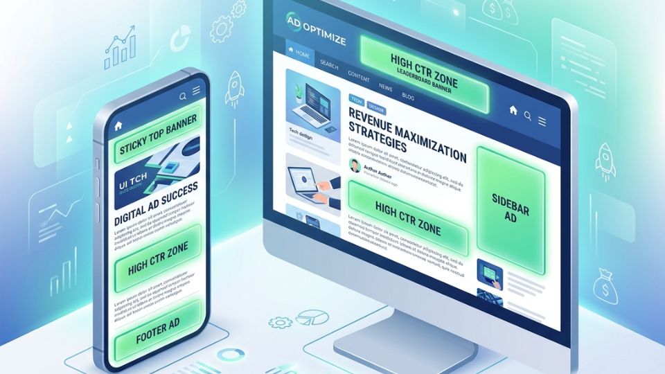
The Perfect Ad Layout Blueprint
To bring this all together, let us visualize the ultimate layout blueprint that maximizes CTR while remaining fully compliant with Google AdSense policies.
The Desktop Blueprint
- Header Area: 970×250 Billboard located directly below the main navigation menu.
- Above the Fold Content: 336×280 Large Rectangle inserted right after the second paragraph, aligned left or centered.
- Sidebar: 300×600 Half-Page ad configured as a sticky element that scrolls with the user.
- Mid-Content: Native In-Article ads placed seamlessly between major H2 sections.
The Mobile Blueprint
- Screen Base: 320×50 or 320×100 Anchor Ad locked to the bottom of the viewport.
- First Screen View: Small text or small native ad below the first H1 title, ensuring main text is still visible.
- Scroll Path: Responsive display ad blocks placed every 3-4 paragraphs down the length of the page.
- Exit Intent: Vignette ads enabled for users navigating between internal pages.
—
Google AdSense Layout Layout FAQ
What is a good CTR for Google AdSense?
While it varies heavily by niche, an average AdSense CTR across all industries typically hovers between 1% and 2%. If your site layout is highly optimized for premium US traffic, aiming for a CTR between 3% and 5% is entirely achievable without harming user experience.
Will adding more ads increase my total earnings?
Not necessarily. Flooding your page with ad units dilutes ad competition and lowers your overall viewability score. Advertisers bid less on sites with poor viewability, which drives down your CPC. Focus on fewer, high-performing placements instead.
Can sticky ads get my AdSense account banned?
Sticky sidebar ads and mobile anchor ads are fully permitted, provided you follow Google’s implementation rules. For sidebar ads, ensure they do not overlap content, navigation menus, or footer elements as the page scrolls.
How do I stop my layout from shifting when ads load?
Cumulative Layout Shift (CLS) hurts your Core Web Vitals and SEO rankings. To fix this, use CSS to reserve a specific height and width placeholder box for your ad units. This keeps your text from jumping around when the ad loads.
—
Turn Layout Optimization Into Revenue
Fixing a low CTR does not require a complete website overhaul. By strategically positioning your ad units within the natural paths of user attention, you create a layout that benefits both your bank account and your audience.
Log into your website backend today. Implement a sticky sidebar, move your top leaderboard below the navigation menu, and shift your first in-content ad closer to the introduction. Monitor your AdSense dashboard over the next seven days, and watch your revenue begin to climb.
—
AI Image Generation Prompt
Prompt: A clean, modern, isometric 3D vector illustration showing a desktop monitor and a smartphone screen side-by-side. The screens display a clean website blog layout with optimized ad placement zones highlighted in glowing translucent green blocks labeled ‘HIGH CTR ZONE’. The background is a clean, minimal gradient of soft blue and white, conveying professional UI/UX design, wealth generation, and digital advertising optimization. High resolution, corporate tech aesthetic, no realistic human faces.